Compare
Medium-fidelity design and prototype for User Experience Design course. Research, problem solving, ideation and page designs for a well known accommodation booking website.
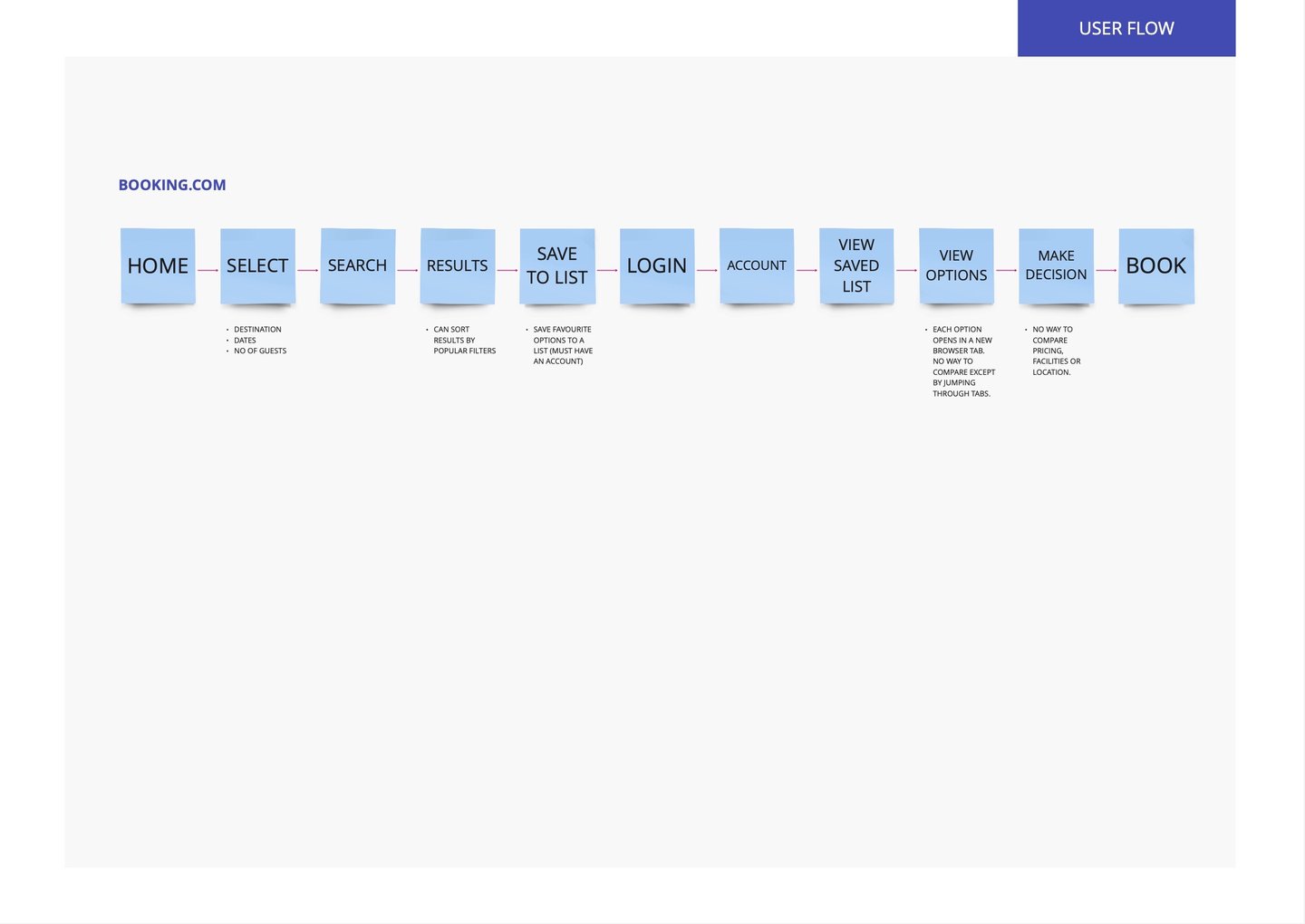
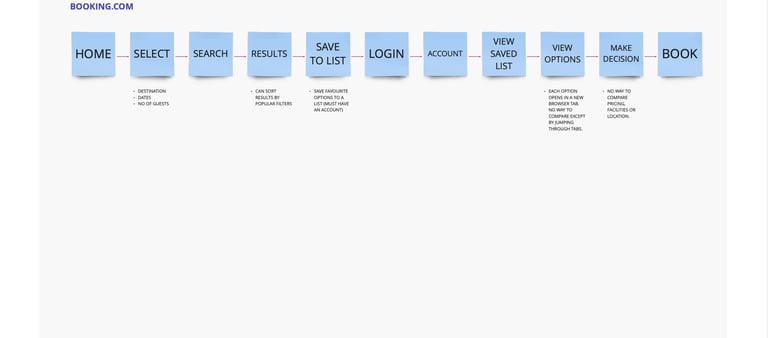
Using the double diamond framework, the current user flow for the website was mapped out and the scope of the project outlined.
This project for the UX Design course began with finding a well known website that could be improved with user experience design.
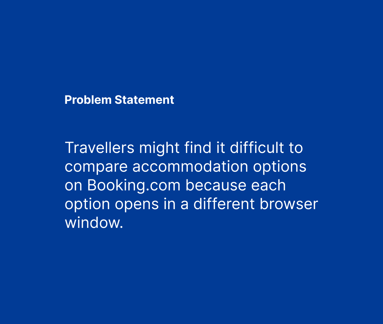
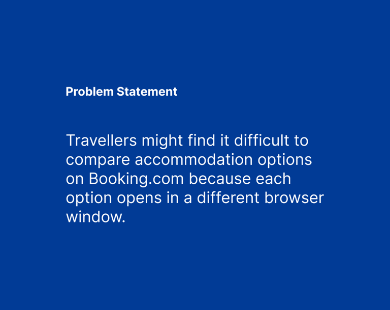
Looking at the Booking.com website, the problem was identified. When users searched for accommodation, each option opened in a new window making it difficult to compare options and decide.
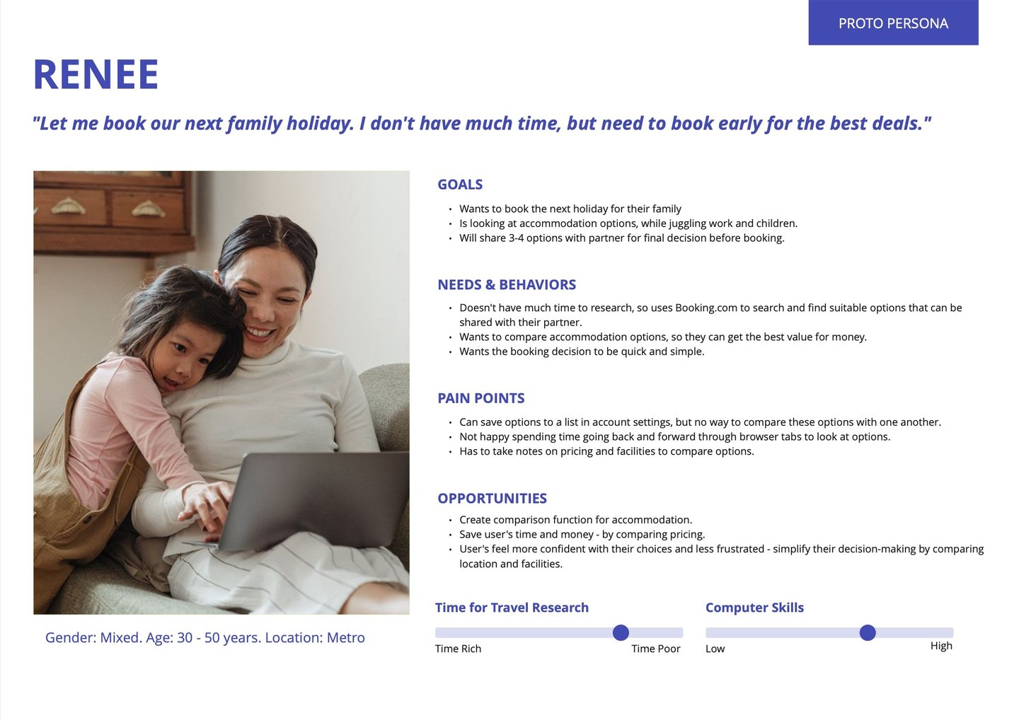
A proto persona of the website's user was created. Desk research looked at user comments and feedback on the booking process (Trip Advisor, Whirlpool and Choice).
Further research looked at competitors to determine what comparison tools were in use. Whilst Air BnB had none, Wotif and Expedia had a tool that needed to be toggled on for use.
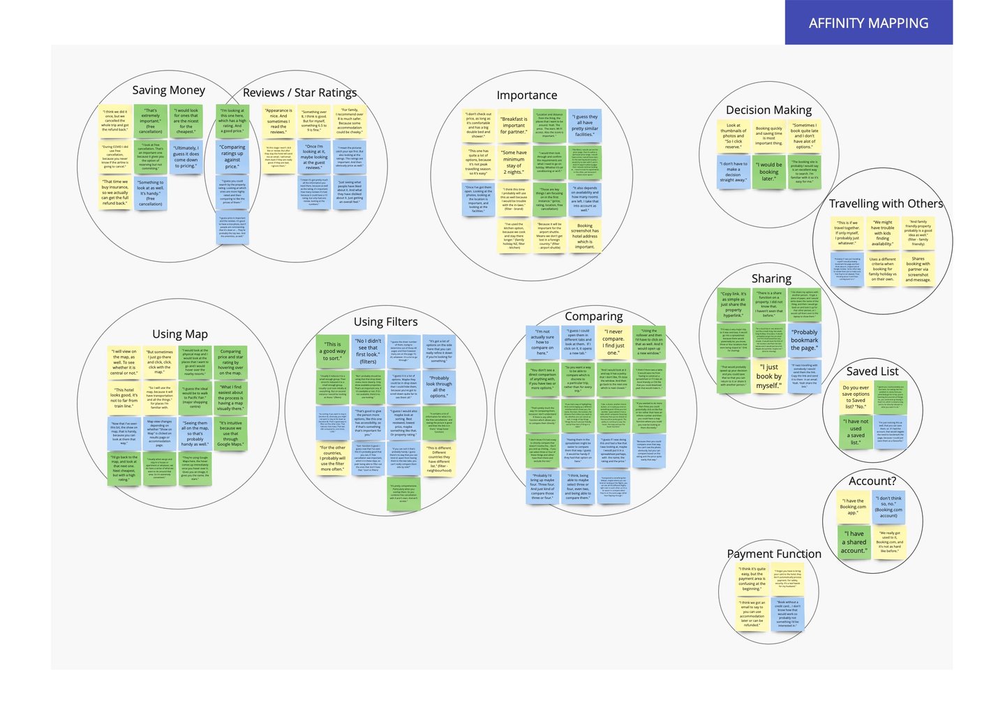
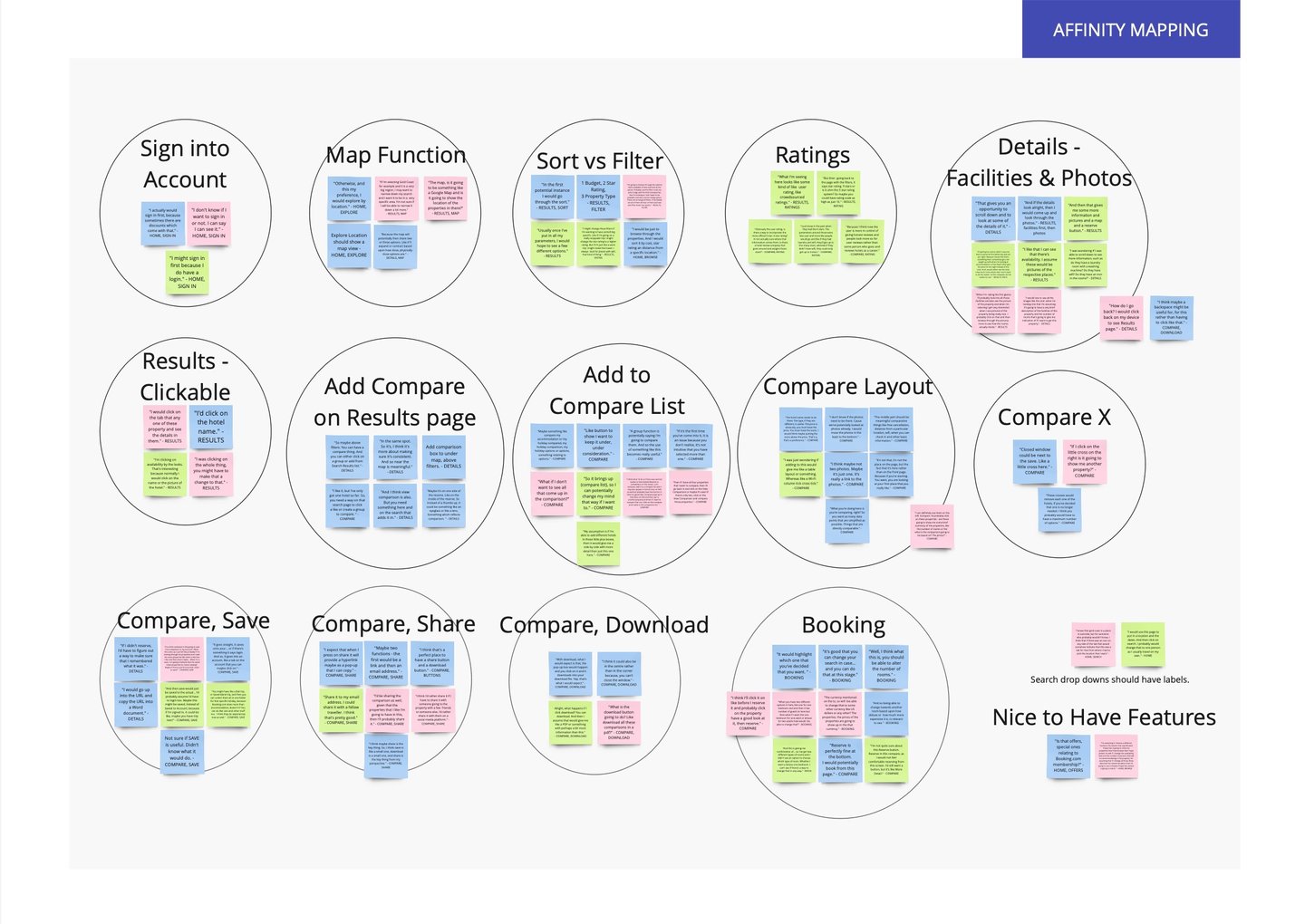
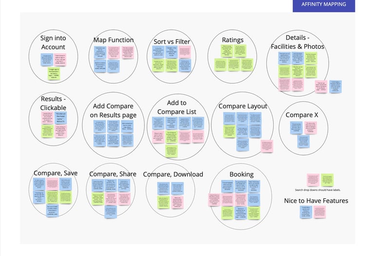
User interviews were conducted and an affinity map captured users key pain points when using the website. These were around decision making, comparing accommodation options and sharing those with travel companions.
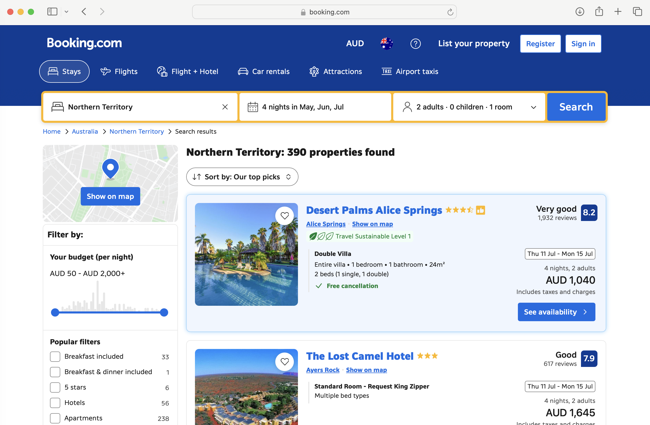
Credit: Image from Booking.com
Define the problem
User flow
Research
User interviews
Generating solutions
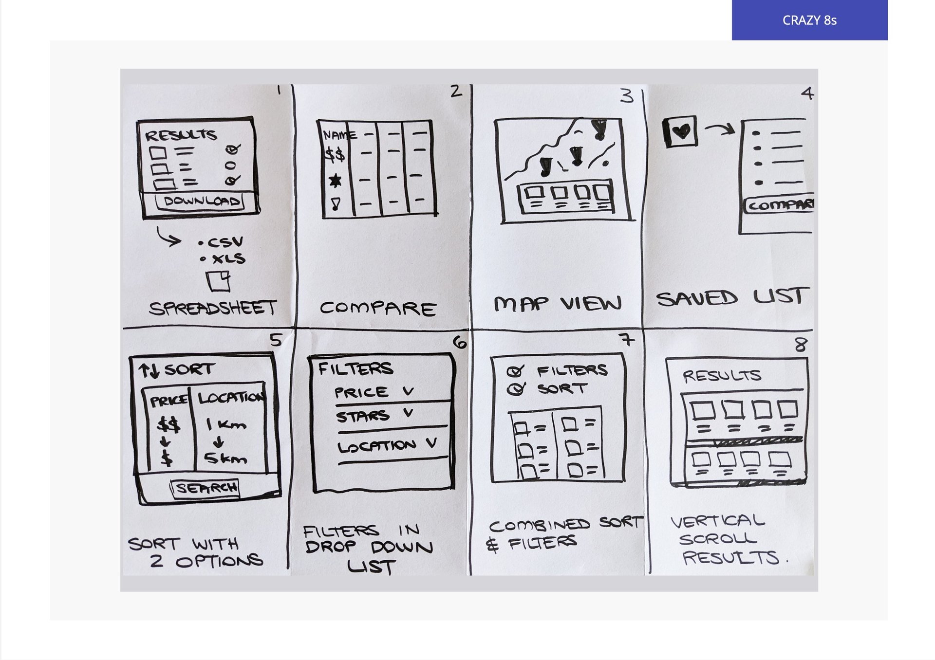
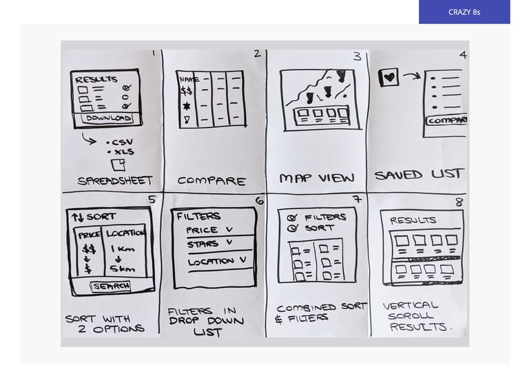
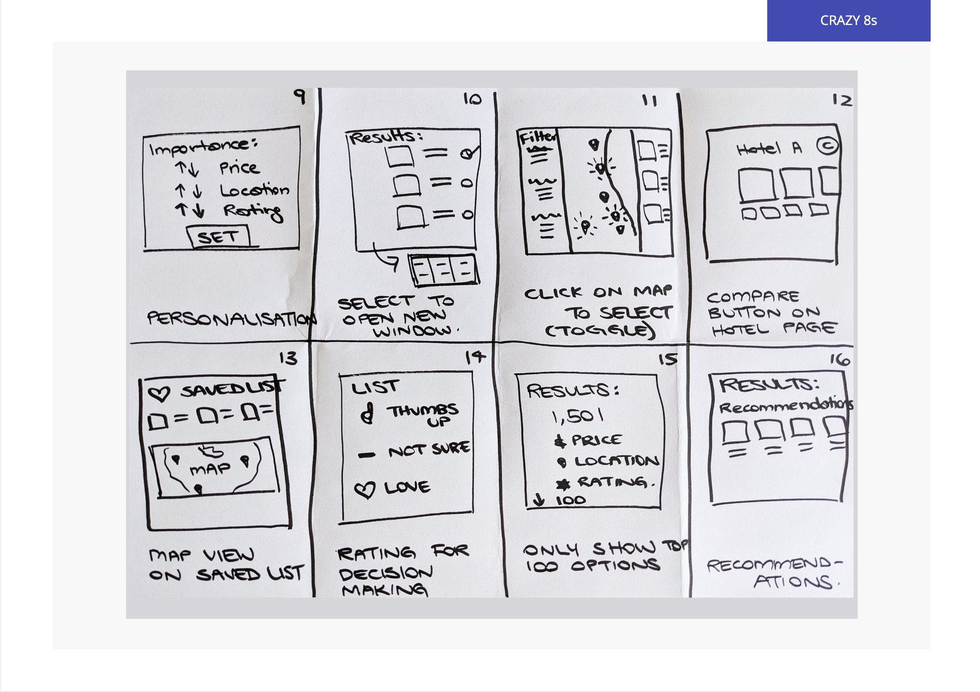
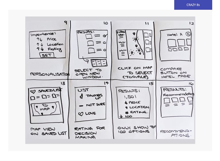
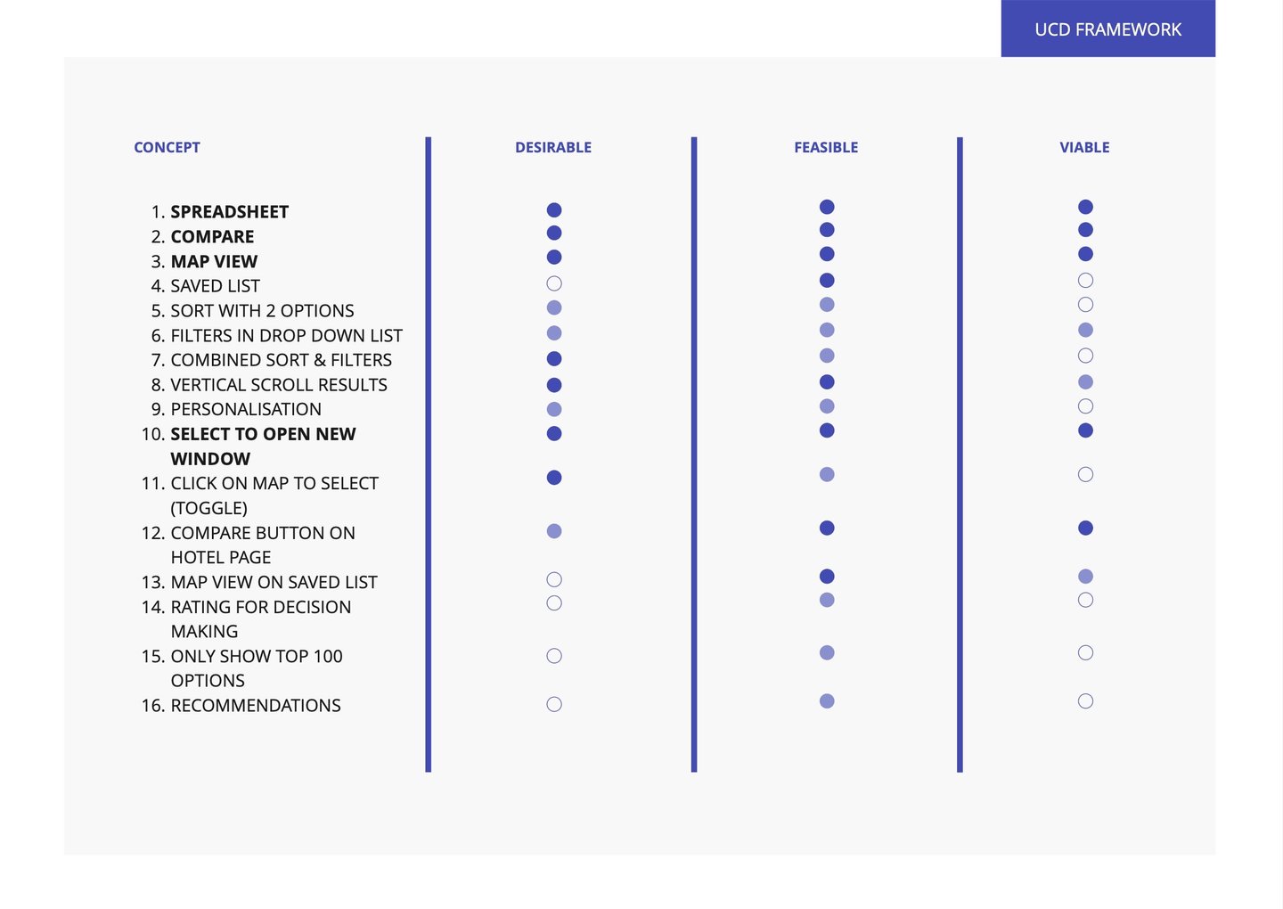
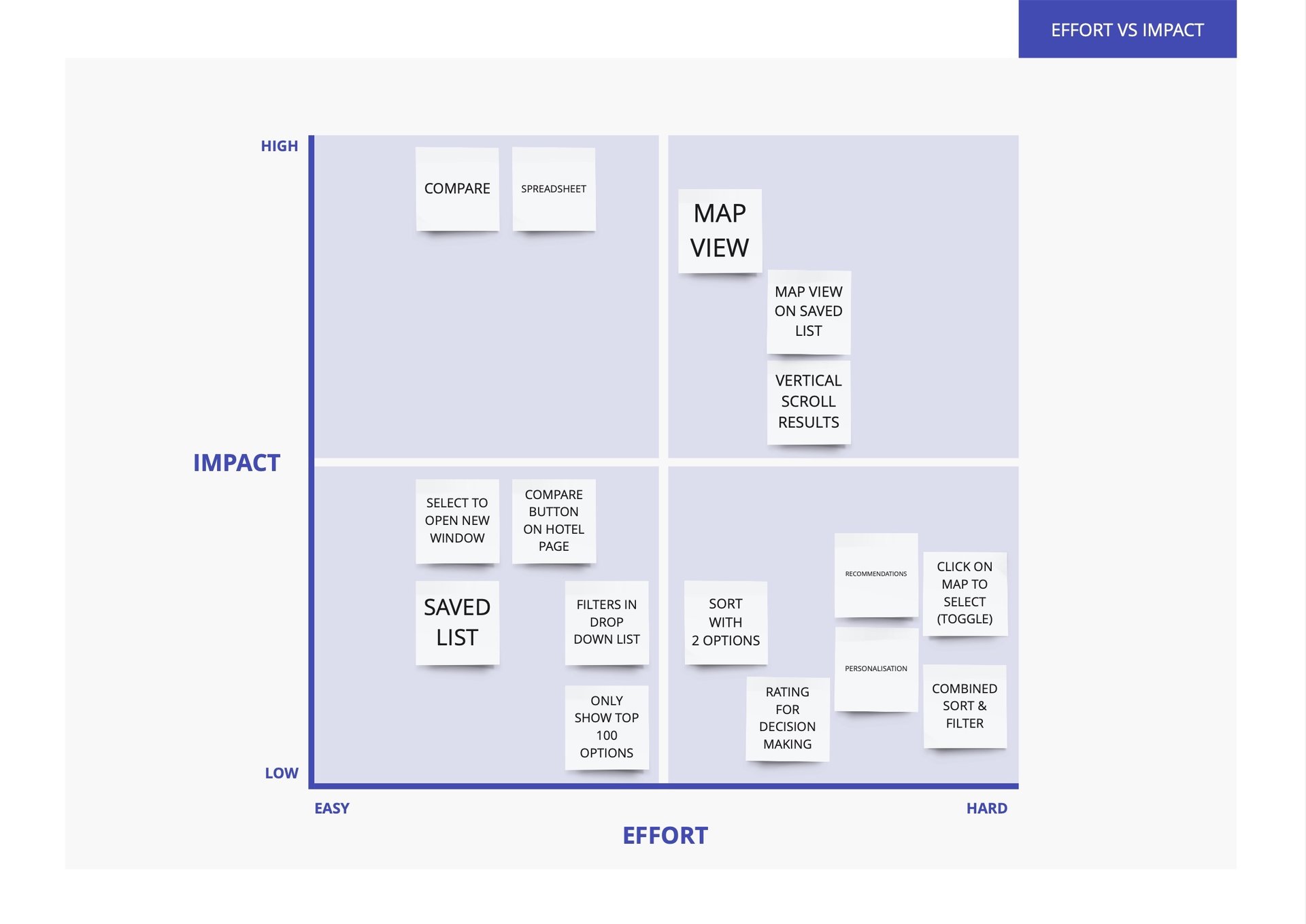
16 ideas were generated quickly using the Crazy 8s technique. These were evaluated based on desirability, feasibility and viability. Then prioritised looking at impact vs effort.
Usability testing was created in person and via Zoom (recorded using Loom). Synthesis of this data created insights and recommendations for the next iteration. Including: easier navigation between accommodation results and details; clearer directions to share or save options and consistent language across buttons.
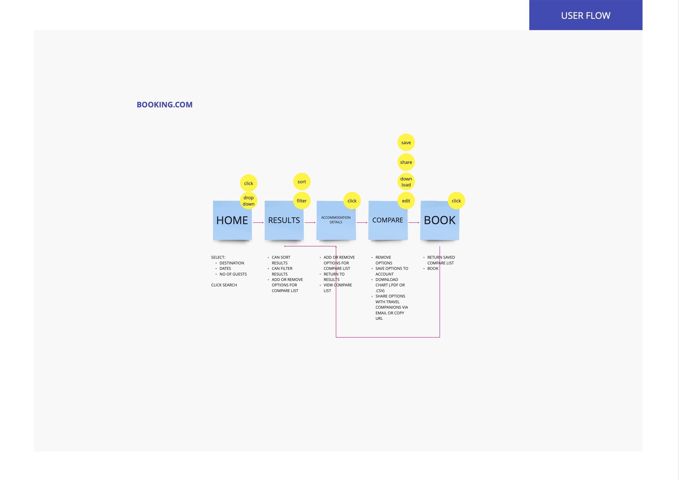
With design solutions chosen, the user flow was reworked to include a comparison function, along with sharing and downloading booking information.
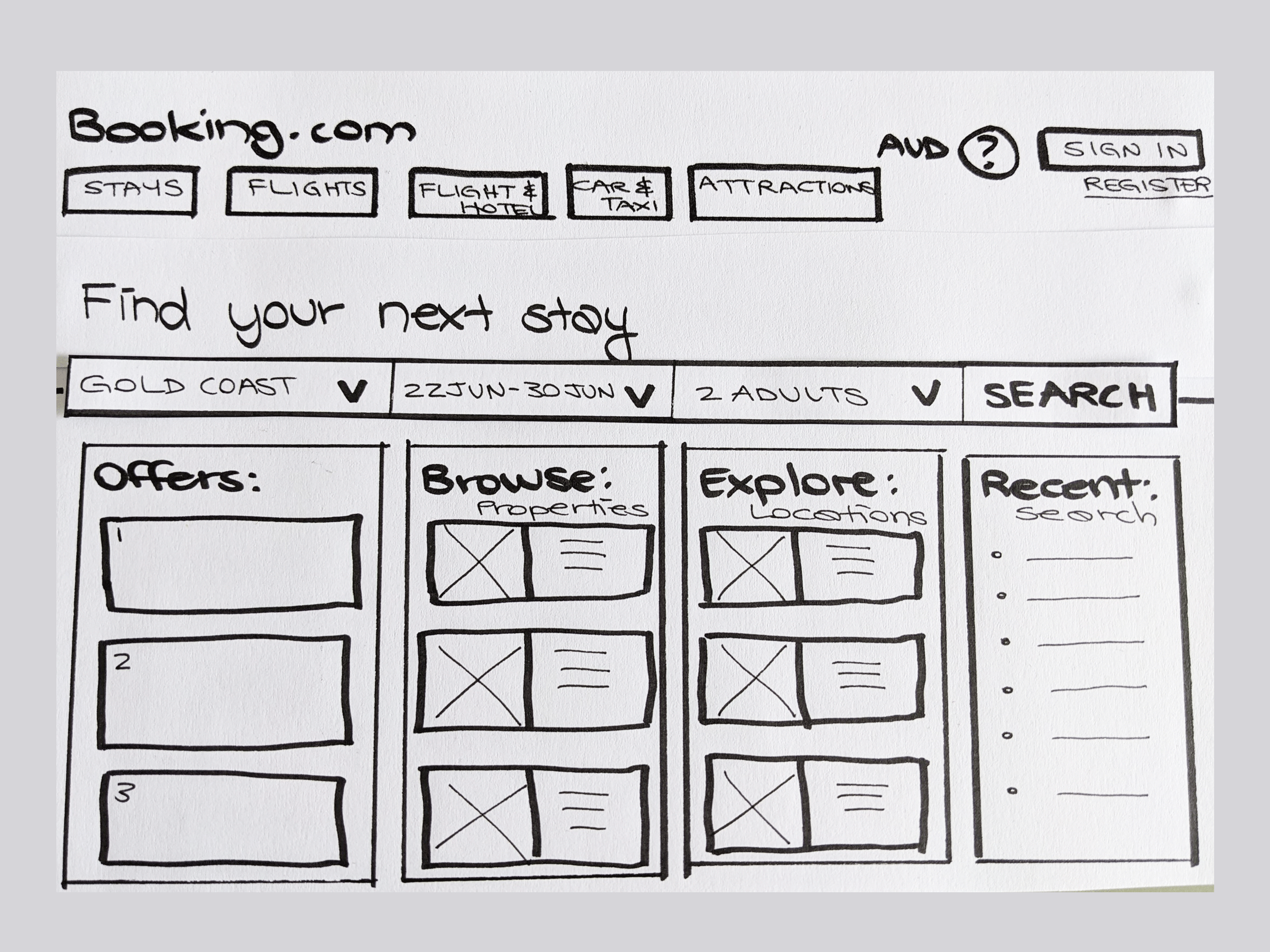
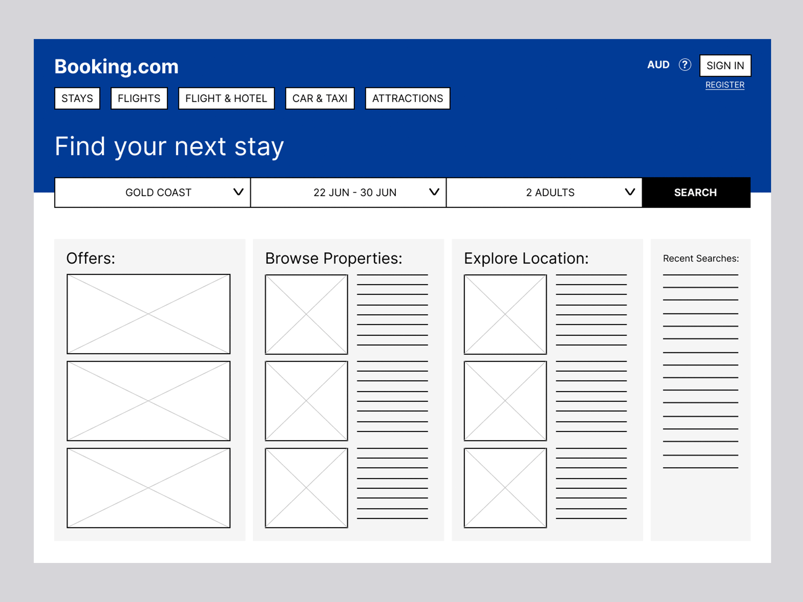
From this updated user flow a paper prototype was created using pen and paper. This allowed for quick sketching and easy design decisions for the key pages for the home, accommodation results, details and a comparison function.
Next, the page designs were taken into Figma and turned into low-fidelity wireframes. Then adding clickable buttons and links between pages to prepare for user testing.
User flow reworked
Paper prototype
Low-fidelity prototype
Usability testing
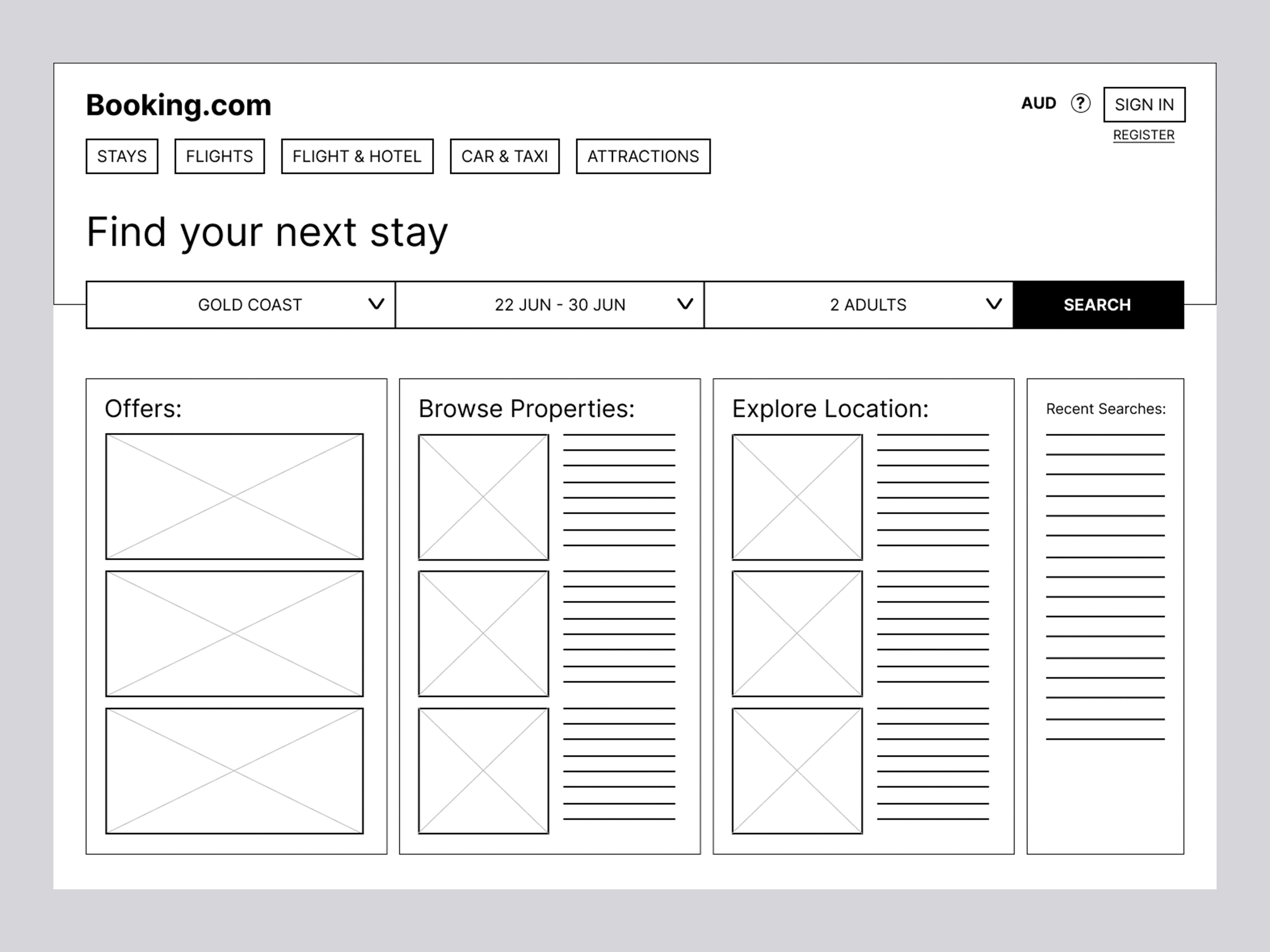
By collating the user feedback into a rolling issues board, the next design iteration incorporated this feedback and refined the pages to medium-fidelity. Once again buttons and links between pages were added making a final clickable prototype.